Padding
Consistent spacing creates balance, making the UI easier for users to scan.
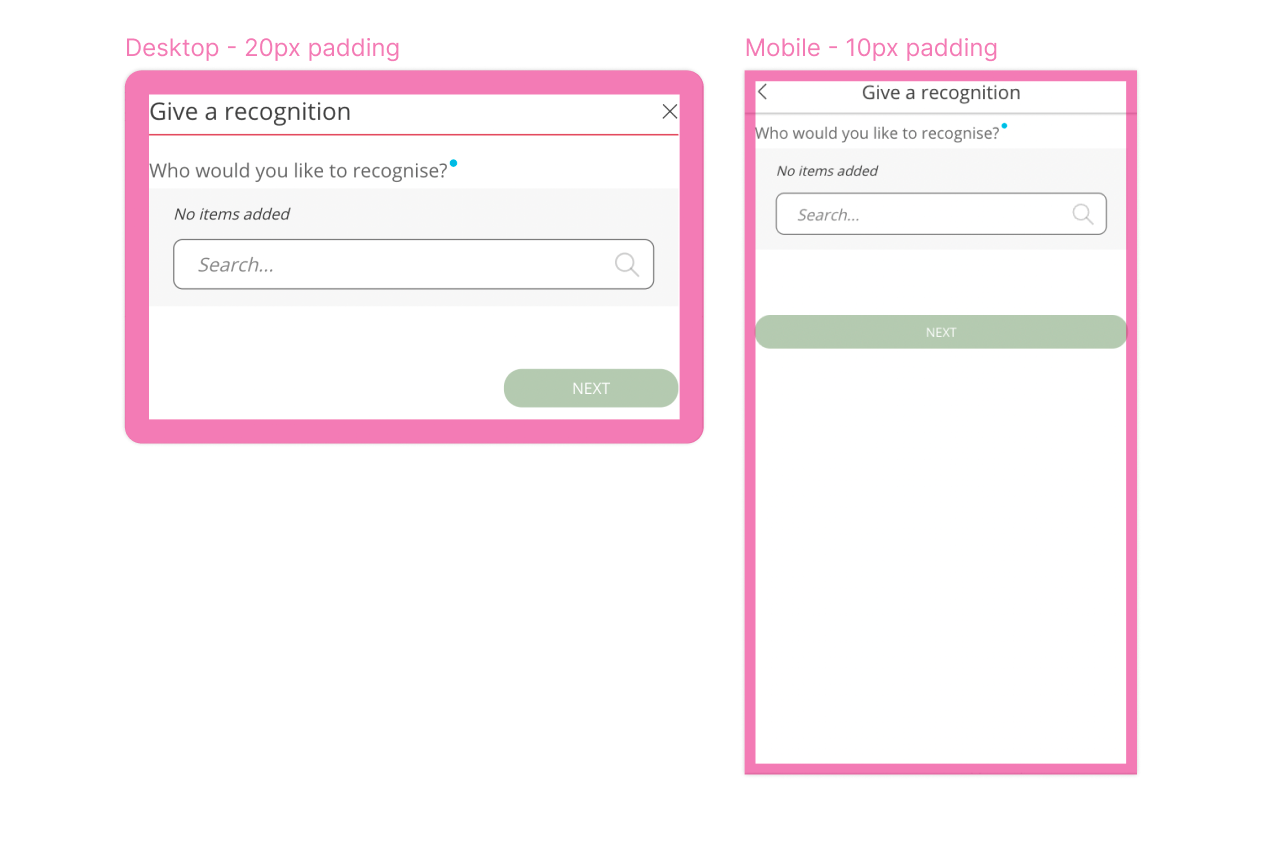
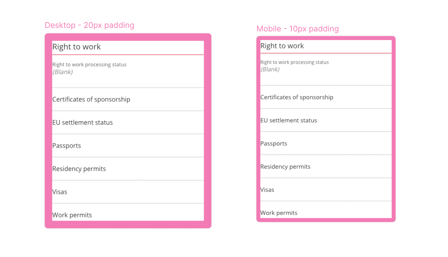
Padding on cards and modals is globally:
- 20px on breakpoints 480px and above
- 10px below 480px
Common mistake:
Using 20px instead of 10px padding for mobile designs. Ensure that desktop always has 20px padding, and mobile has 10px padding.
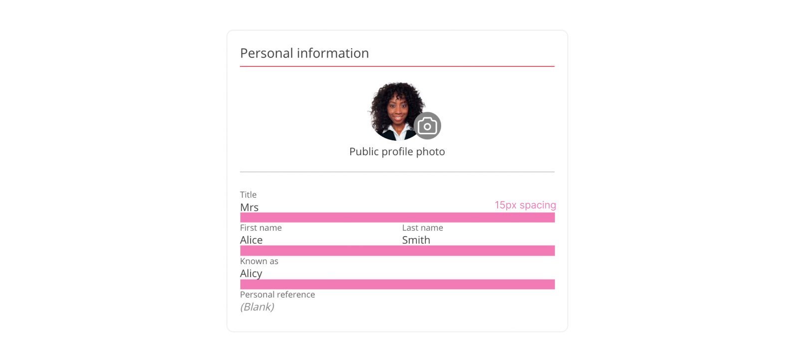
Spacing
Consistent spacing creates visual balance that makes the user interface (UI) easier for merchants to scan. Apply consistent spacing to improve the quality of the UI.
In People First we use spacing of 5px, 10px, 15px and 20px in most cases. Mobile view will usually have smaller padding than on desktop.
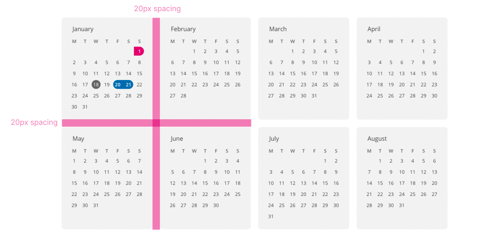
An example of 20px spacing in the System
20px padding is used between cards and elements that are not closely related, this gives the elements breathing room so the page isn't too busy
An example of 15px in the System
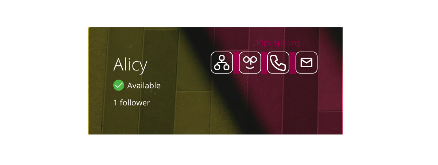
An example of 10px in the System
10px padding is used for elements that are related and grouped together